SÓNAR FESTIVAL
MOTION IDENTITY
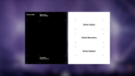
Sónar is more than a festival, it's a global brand, with editions in Barcelona, Lisboa, and Istanbul. With a presence that spans borders and time zones, the challenge was to define an audiovisual system that could anchor this growing network without ever flattening its diversity.
THRU was brought in to craft the behavior behind Sónar’s new identity: building a living, breathing system designed to function consistently across editions, formats, and years. The solution needed to be universal, yet minimal enough to let content lead the conversation.
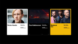
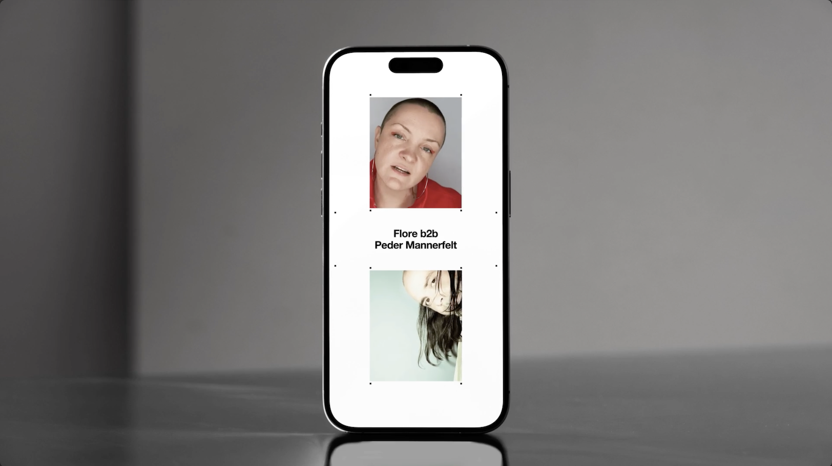
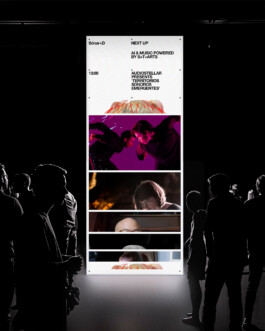
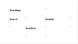
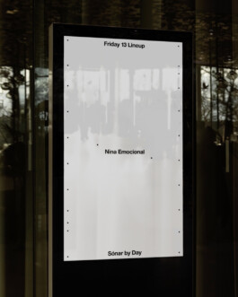
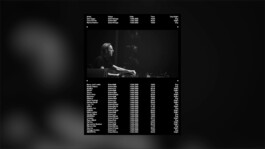
At the core of the system lies the square, Sónar’s iconic logo, reduced to its simplest form: nodes. These micro-units of movement activate and deactivate, allowing information to appear and disappear in rhythm. When combined with typography and content, the nodes generate a visual language that is both consistent and highly expressive, capable of flexing across Sónar, Sónar+D, and every piece of communication in between.
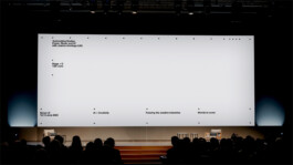
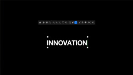
This design isn’t static. It’s built to move, supporting a wide spectrum of outputs, from reactive social posts to immersive stage visuals. And because Sónar’s team is constantly creating, we developed a suite of fully editable templates paired with custom tutorials, giving them the tools to build content at scale, without sacrificing craft.
The graphic concept and visual identity were developed by Morbo and Vagrant. THRU took this foundation and gave it motion, engineering a modular system that doesn’t just represent Sónar’s voice, but speaks it in motion.